Team: Lina Khalighi
Role: UI/UX Designer – 2025
Platform: Responsive Web (Mobile)
Project Overview
The goal of this project was to design a user-friendly and trustworthy mobile app that enables parents to easily buy and sell secondhand children’s clothing, promoting sustainability and cost savings through a seamless resale experience.
Target Audience
Busy parents and guardians, including people with impairments, looking for a simple and accessible app to buy and sell kids’ clothes safely and easily.
The Problem/Pain Point
- Kids outgrow clothes really fast
Parents end up buying new clothes all the time. - Selling used clothes is a hassle
It takes too much time and effort. - Secondhand shopping feels risky
Buyers worry about stains, sizing, and quality. - Parents are busy and stressed
They need a simple, fast, and easy app. - Kids’ clothes create a lot of waste
Parents want eco-friendly, sustainable options.
Initial Concepts & Design Strategy
My design process started with defining the user needs based on my fictional personas and empathy map. I focused on making the interface simple, intuitive, and accessible. The first concepts were visualized through paper wireframes, where I explored different layout ideas and prioritized user flow.
Feedback from my low-fidelity usability study showed that some features were unclear or hard to find. Based on that, I adjusted button placements, simplified navigation, and added visual hierarchy. These changes were carried into the high-fidelity prototype, which I tested again to confirm the improvements met user expectations.
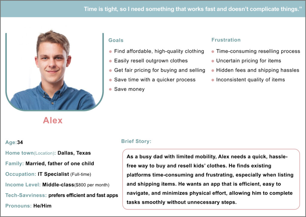
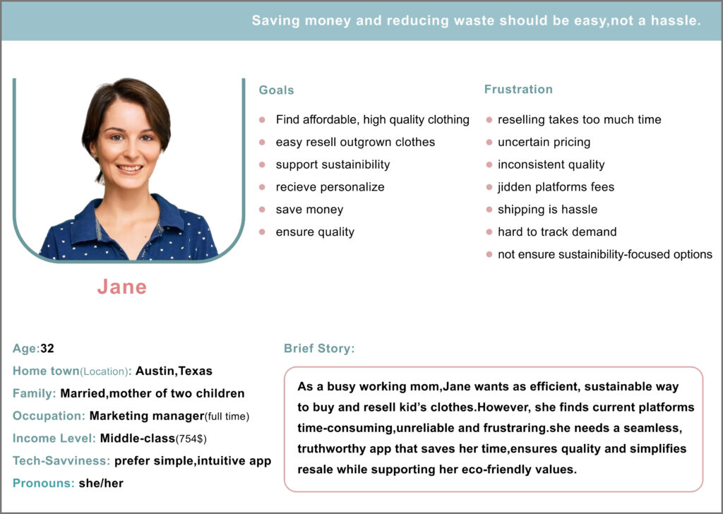
User Personas
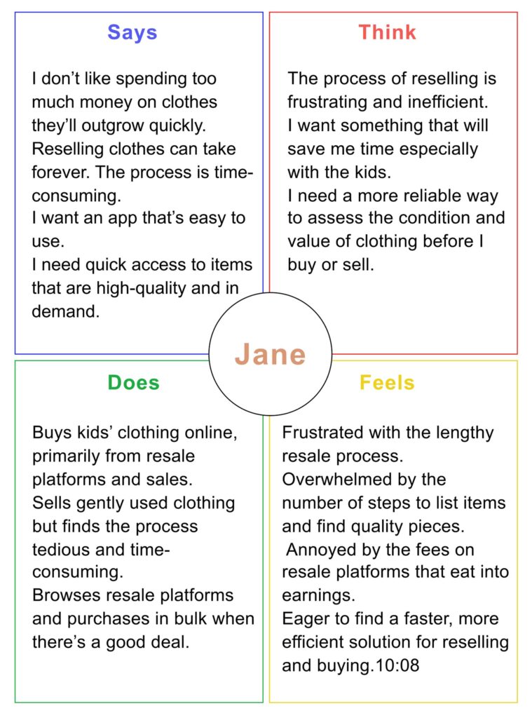
To better understand the goals and frustrations of my users, I created two fictional personas. These personas helped guide my design strategy and kept user needs in focus throughout the process.
Empathy Map
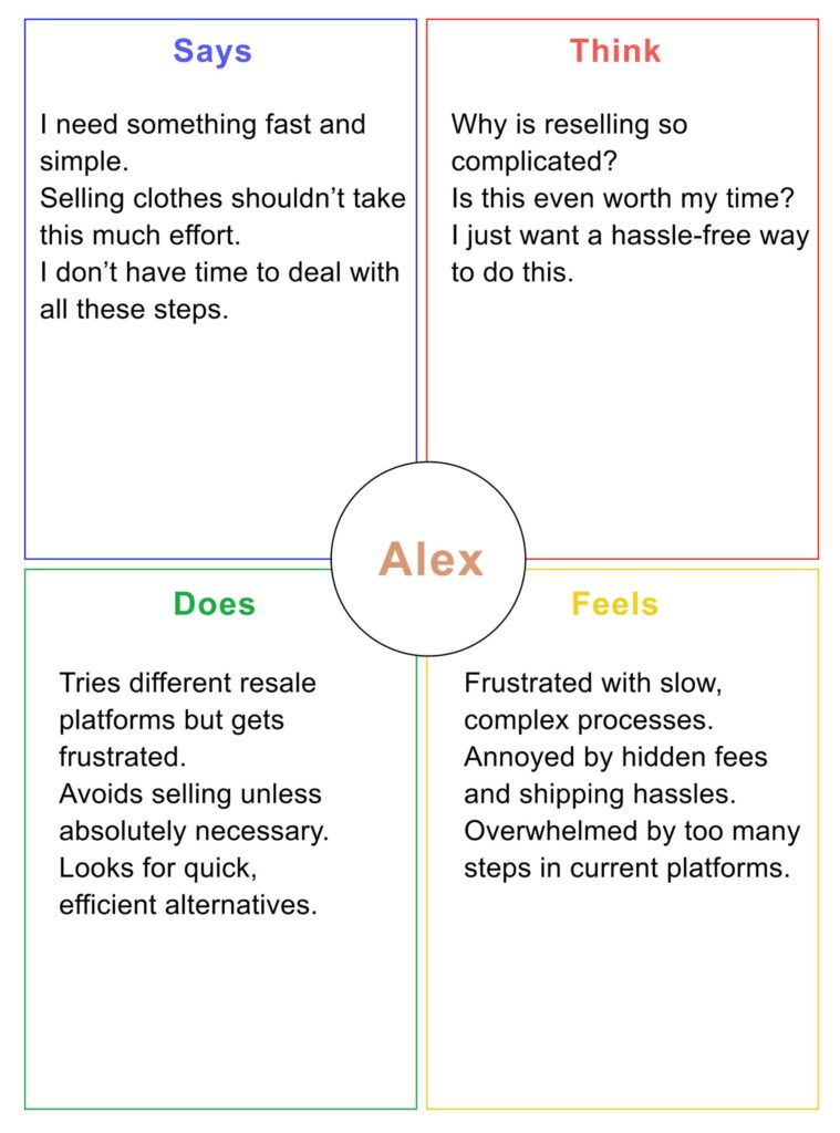
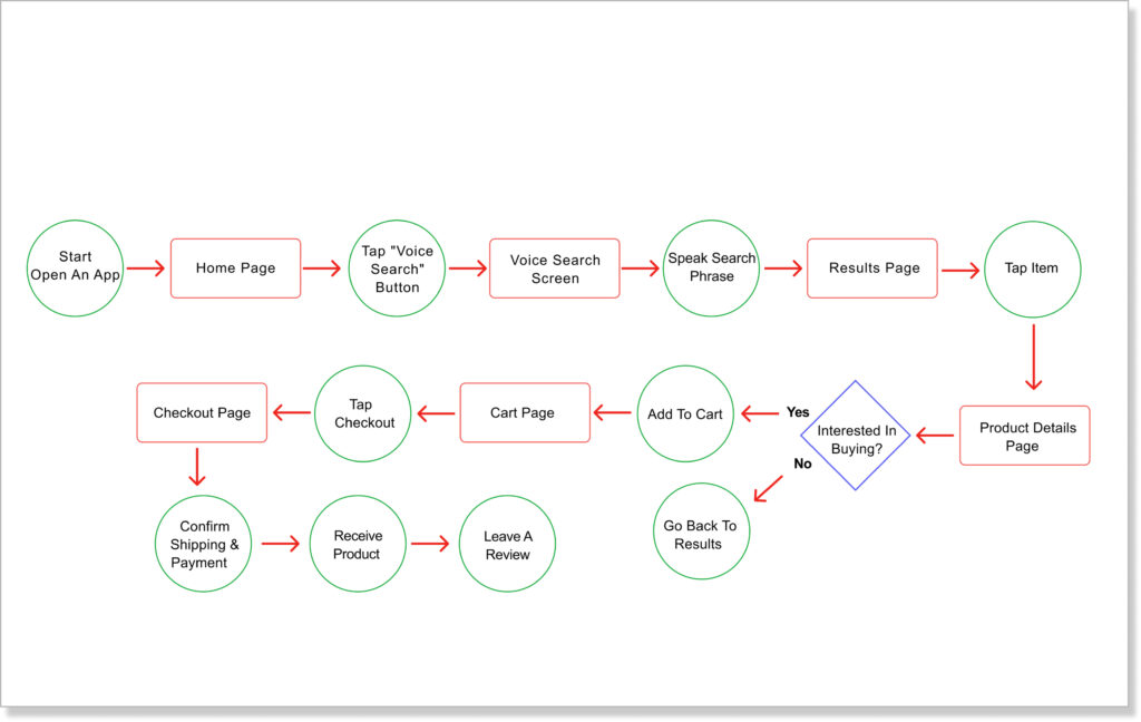
User Flow(Alex)
User Flow(Jane)

Search Conduct
I started with a competitive analysis of similar apps to identify design patterns, usability gaps, and opportunities for improvement. Then, I conducted two rounds of unmoderated remote usability tests using my low and high-fidelity prototypes. I asked friends and family to complete key tasks and share feedback, which helped me uncover pain points, validate design choices, and refine the overall user experience.
Key Challenges
- Designing an easy-to-use app for busy parents and guardians, including those with impairments
- Creating trust in buying and selling secondhand kids’ clothes
- Making sure the app works well on different devices and screen sizes
- Doing the entire design process alone with limited time and resources
- Using fictional personas to understand users and guide the design
Initial Concepts & Design Strategy
My design process started with defining the user needs based on my fictional personas and empathy map. I focused on making the interface simple, intuitive, and accessible. The first concepts were visualized through paper wireframes, where I explored different layout ideas and prioritized user flow.
Feedback from my low-fidelity usability study showed that some features were unclear or hard to find. Based on that, I adjusted button placements, simplified navigation, and added visual hierarchy. These changes were carried into the high-fidelity prototype, which I tested again to confirm the improvements met user expectations.
Sketches & Wireframes
I started with paper sketches to explore layout ideas and moved into low-fidelity digital wireframes using Figma to refine and structure the design before usability testing.

Result of Any User Testing
I conducted an unmoderated remote usability test with 5 participants. Each person was asked to complete a core task: purchasing a second-hand clothing item. This involved navigating through the main flow — from browsing, selecting an item, and viewing product details, to completing the purchase.
The goal was to evaluate how easily users could:
- Move between screens smoothly
- Understand the flow without getting lost
- Find key actions like “Add to Cart” or “Buy Now”
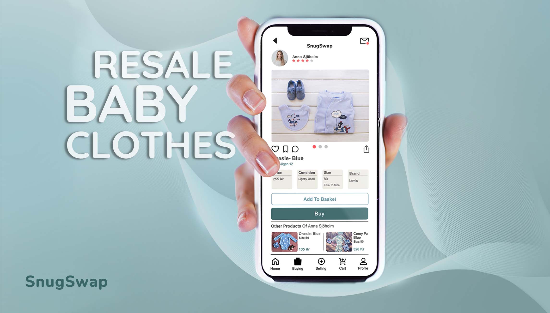
Final Designs
After iterating on feedback from usability testing, I created a set of polished, high-fidelity screens. These designs reflect a clean user flow, improved navigation, and clearer visual hierarchy. I aimed to create a friendly and intuitive interface for users looking to buy second-hand clothing with ease.

Conclusion & Next Steps
This project gave me a full end-to-end experience of the UX design process — from empathizing with users and creating personas to designing and testing a complete second-hand clothing shopping experience.
One of the most valuable lessons I learned was how small design changes, guided by real user feedback, can significantly improve the user journey. For example, adding simple visual feedback after adding items to the cart made the process feel smoother and more intuitive.
If I continue developing this project, my next steps would be:
- Conducting further usability testing on the high-fidelity version
- Exploring additional features like filters by condition or brand
- Improving accessibility features for a wider audience
Overall, this project helped me grow as a designer and gave me more confidence in making user-centered decisions.
This Figma link showcases a high-fidelity prototype. Please note that some interactions are not fully functional in this preview version.

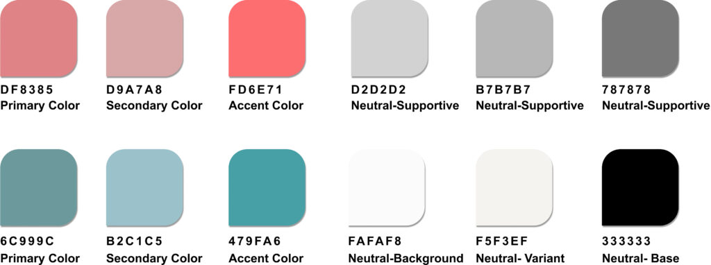
Color palet
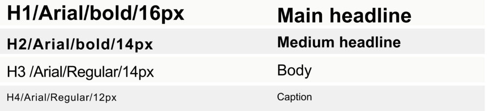
Typogrophy
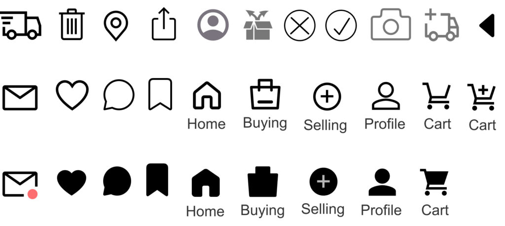
Iconography